menu
Trustpilot
Search

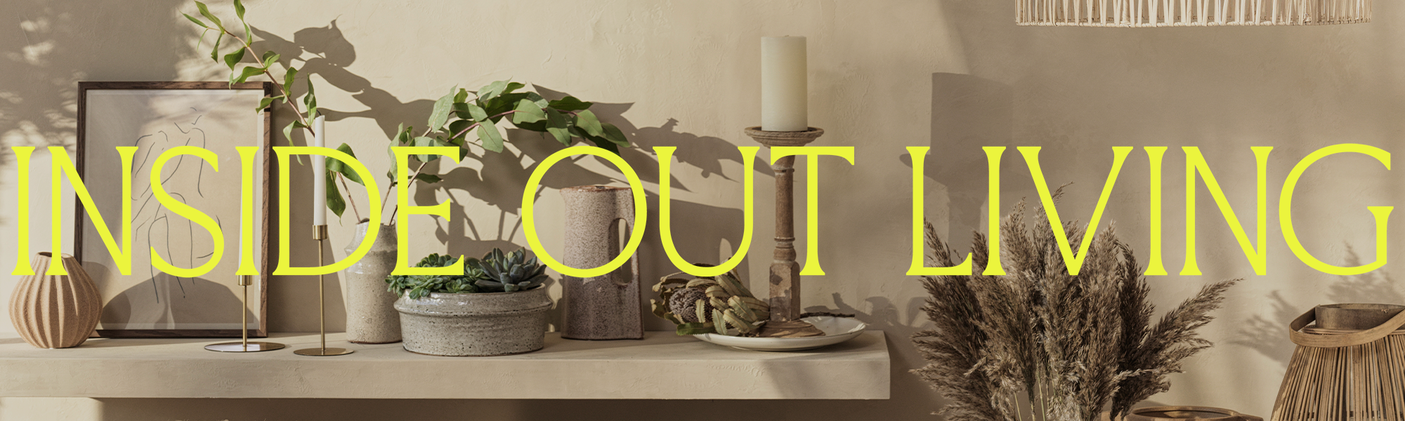
Out with the old and in with the new

We decided it was time to freshen things up and have treated ourselves to a little makeover!

If, like us, you are a bit geeky when it comes to branding (or rebranding, in this case) and want to know more about our new look and feel, then please read on. If you can’t think of anything more boring, then thanks for even reading this far. 😊

The NEW Logo

Taking cues from fashion and lifestyle brands, and editorial layouts, our new logo is big and bold, but also refined.

We have three versions depending on where it appears: a version across one line, two lines and three lines, as well as a monogram of just our initials – IOL.

Confident colours

Bold, bright and beautiful is what we have gone for. We wanted something fun and energetic to reflect the IOL spirit! Our palette is made up of a bright yellow, forest green, earthy terracotta and a delicate lilac, supported by an off-white and an off-black.

Intrigued why we went for those colours? Here ‘s why…

  • Bright yellow – injects some energy and mirrors the light found throughout inside and outside spaces.
  • Forest Green – to represent the garden and outside aspects of the brand.
  • Terracotta – inspired by nature and the natural materials that we love
  • Lilac – a little touch of colour that symbolizes tranquillity and brings a bit of Zen, because life is about balance (and the other colours are quite bold)
  • Off-White – a nod to the clean and neutral aesthetic that a lot of our products have
  • Off-Black – a classic staple, our take on the LBD.

Beautiful Brackets

A key element of our new branding is our brackets, which we use to frame whole scenes or highlight specific products within scenes. In time, we hope these become synonymous with the brand and the idea is that you could see them applied, without any logo, and know it’s us. Well, that’s what we are striving for 😊

The Square brackets (which look like an I, when pushed together) are used when referring to indoor products, while the curved brackets (that look like an O, when pushed together) are used for outdoor products.

[ ] = INSIDE
( ) = OUTSIDE

Typography

The perfect marriage of modern and classic typefaces, our typography choices reflect that our brand sells classic and contemporary styles, that can be easily mixed and matched.

Art Direction

Honest and warm photography including light and shadow play, showing people interacting with our products. We are striving for imagery that captures the atmosphere of a home, inside and out.

Thanks for reading

So that’s the inside track on the new Inside Out Living brand identity, and the reasons behind all the choices that we made. We love our new brand look and hope you do, too!

Thanks so much for reading, fellow brand-geek, we applaud your interest in “the why”. 😊


Share

Discover

Beautiful tips, hints, news and trends from Inside Out Living

Sign up to our newsletter

By subscribing you agree to our Terms & Conditions and Privacy & Cookies Policy.

By subscribing you agree to our Terms & Conditions and Privacy & Cookies Policy.